MoMO's
Full Being Wellness
Logo and brand design
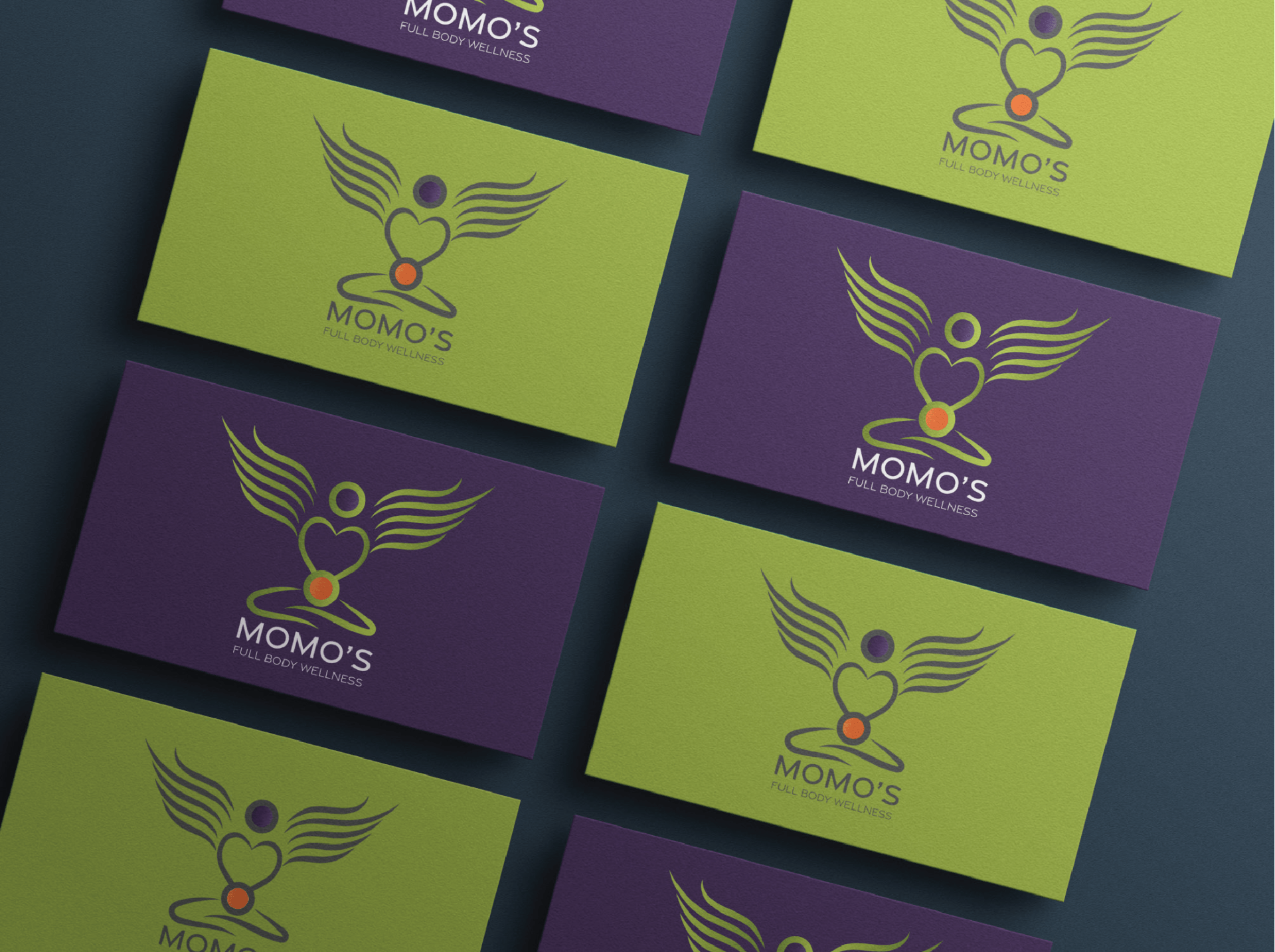
MoMo's full body wellness

This fresh and visually striking concept depicts a stlyised, natural and relaxing green angelic figure, with the purple crown chakra in the position of the head, signifying the connection with the universe, and the higher consciousness.
The central figure’s “wings” are emanating outwards from a place of love, depicted by the central heart symbol. The lower orange orb signifies the sacral chakra, responsible for the gut and Immune system, with the angelic figure crossed legged in meditation.
Below the figure is a clean, modern and crisp grey logotype. The colour grey is known as “the great balancer” as it sits between the light and dark and enables other colours to shine in their own power.
However, this logo can be viewed in two ways. It can be viewed as described above, but it can also be viewed as a client who’s head is formed by the sacral chakra, being given a massage by a loving form, with healing energy waves eminating outwards through the heart of the healer, thus allowing dual perspectives and viewpoints all with unique symbolism and meaning which compliment eachother and the business as a whole.
.