moxygen
"breathing life into a brand"
Logo design
Logo design
moxygen: A living logo
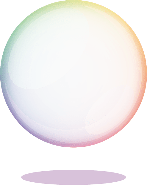
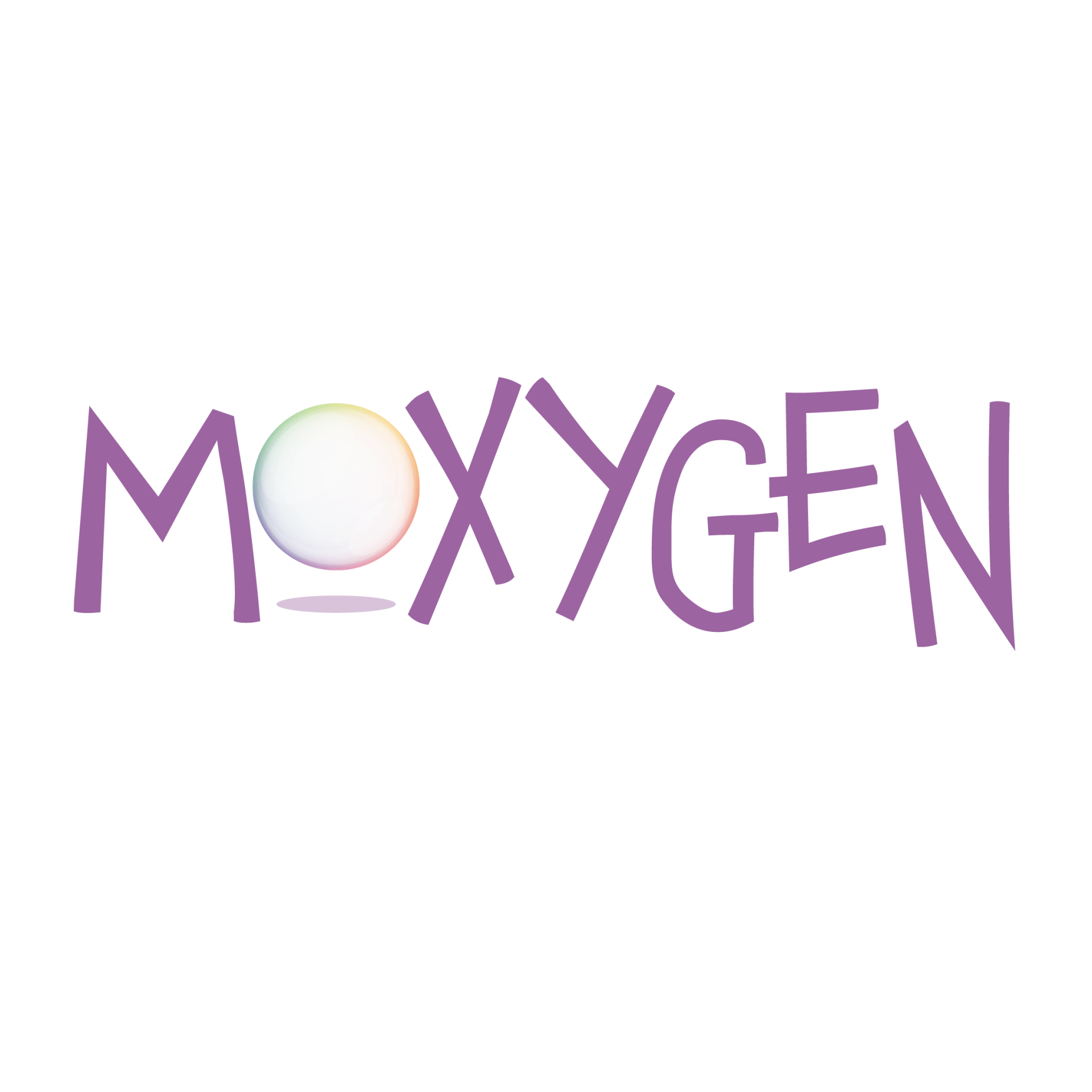
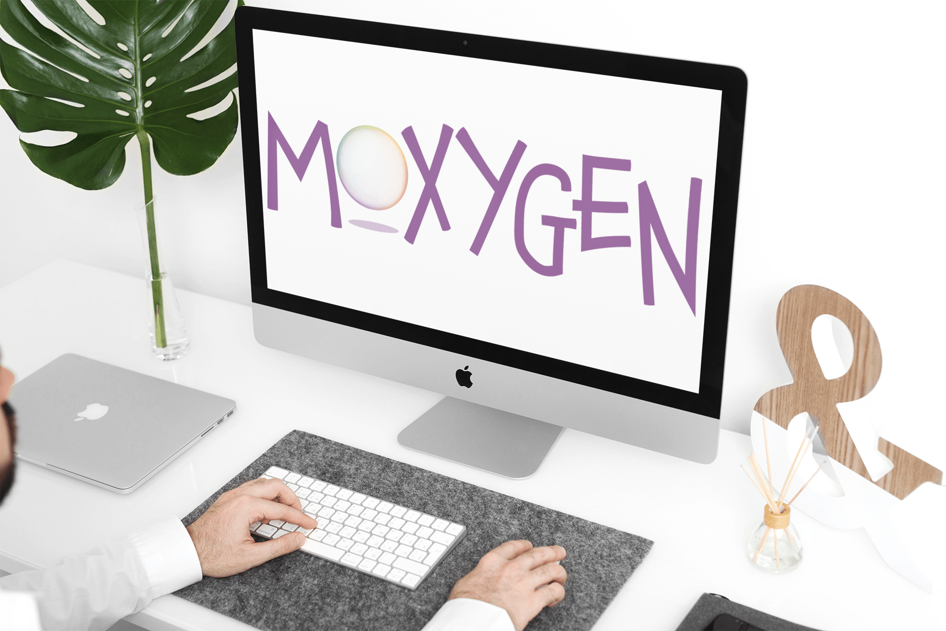
A good friend of Owntwo Creative, Moxy, asked us to create a logo for her new animation business. The important factor about this new business was that it had to reflect the core purpose of the business, movement. We set to work creating a logo that could be animated, as well as giving a sense of playfulness and fun. As the name itself is a play on words, we wanted the logo to reflect the joy which animation brings, as well as give it that cartoon feel. We chose the bubble as the logo mark as it perfectly symbolises the fluidity and delicate skill needed in creating animation. Moxy was thrilled with the logo and has even created an animated version, which looks amazing!
Colour Scheme
The French lilac primary colour scheme for the Moxygen logotype, was chosen, as it creates a bold but delicate silhouette juxtaposed next to the bubble, but also because purple is a colour of creativity and visual illusions, which sums up the art of animation perfectly. However, just as the art of animation is changeable, so we wanted the logotype to be adaptable too, which is why we chose a single colour scheme, to enable the logo to be used in a multitude of colours, to be fluid and shift with the light, just as a bubble does!
Breathing life into logos
Moxy wasted no time in getting to work animating her logo. We've worked with Moxygen to animate some of our other logo designs in the past.
Bubble logomark
The bubble uses a subtle spectrum of colour to give it a fluid and iridescent appearance. The shadow uses a transparency of the logotype colour to offset the bubble and provide it with the appearance of lift.