SPRITELY SUSTAINABLE
Environmental education and training
Logo design & branding
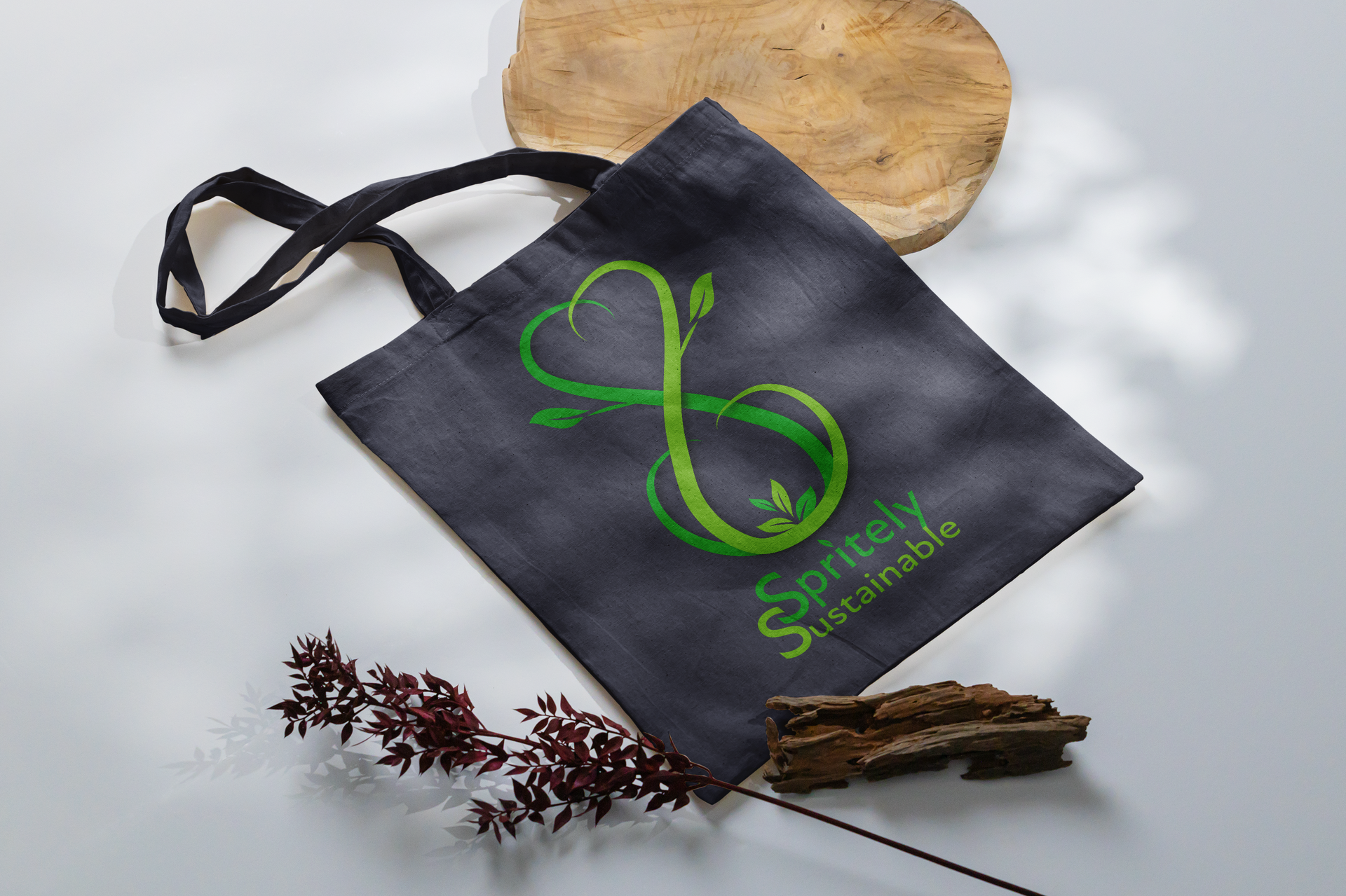
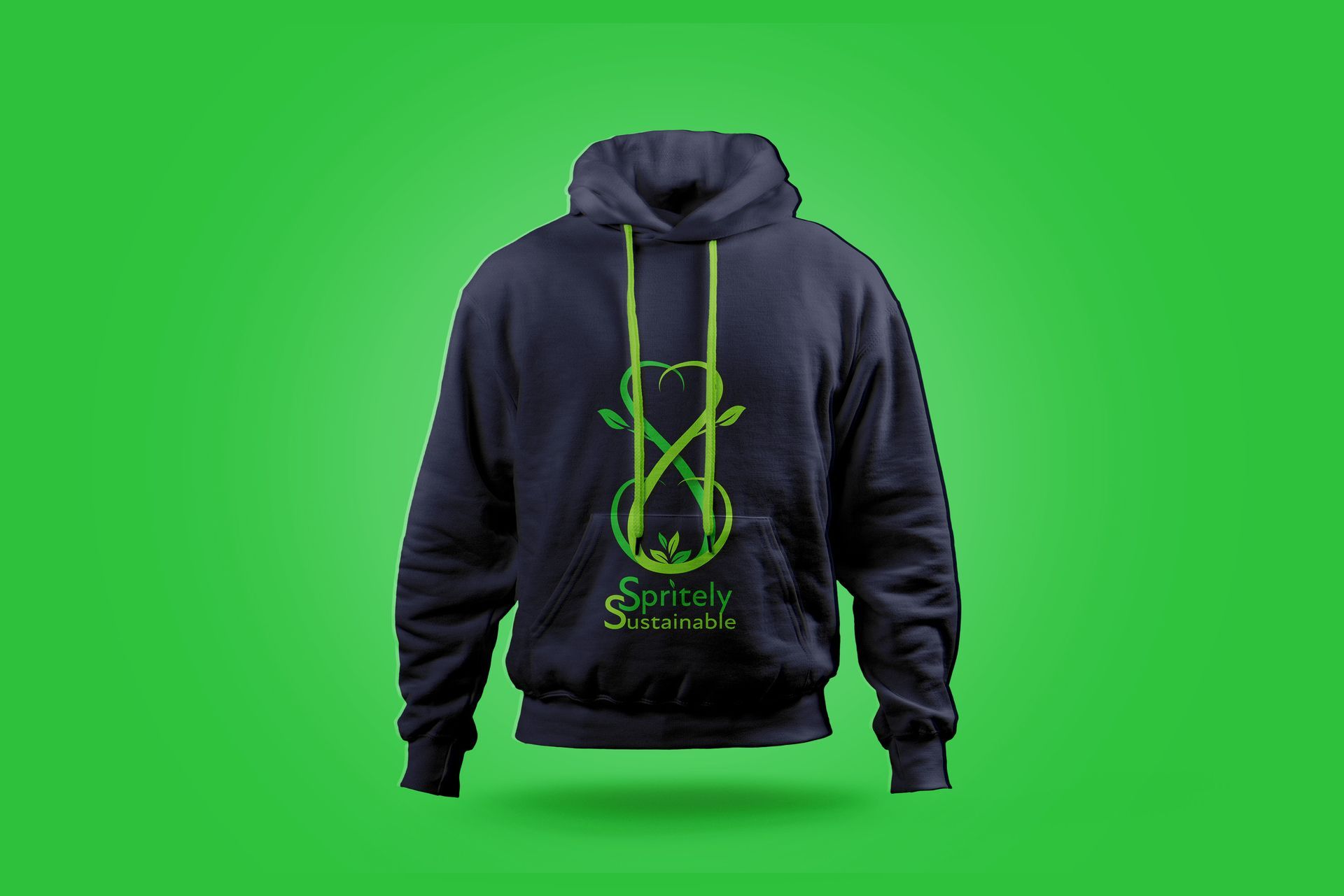
Spritely sustainable
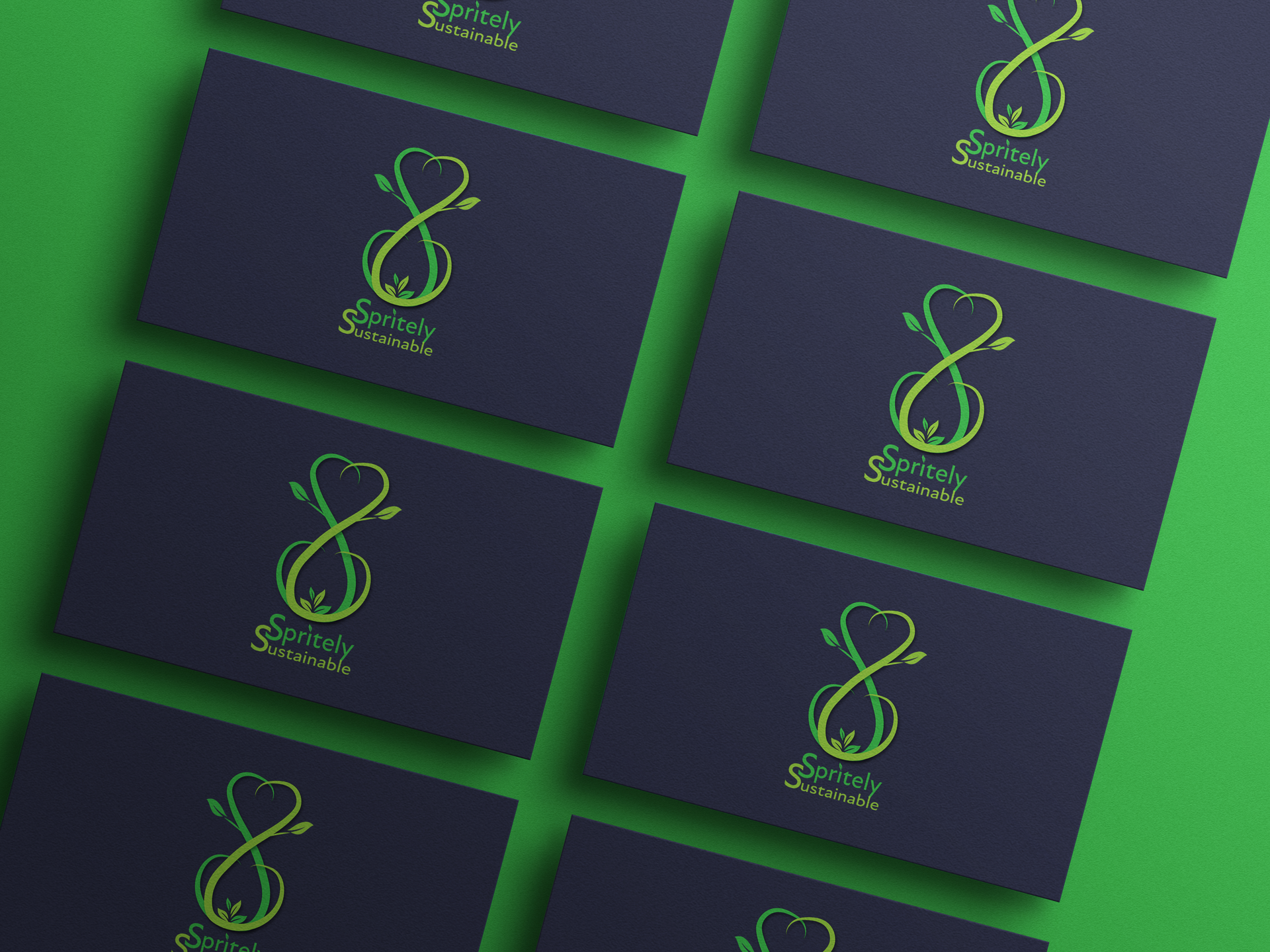
This clean, symmetrical logo creates a striking image of
balance and sustainability. It uses the two initial letters of the name SPRITELY SUSTAINABLE, depicted as naturally growing vines which are perfectly symmetrical and balanced,
juxtaposed in such a way as to create an upright infinity
symbol. This is symbolic of the importance of nature’s
infinite abundance and sustainable life on earth.
The symbol also doubles as an hourglass with a heart shaped top. This is symbolic of the limited time we have to act in
order to ensure the continued sustainability of our planet, with the heart shaped top symbolising the love and togetherness
we must show in order to work together to create a sustainable future.
The top of the vines point downwards to draw the eye to the
renewal of life in the growing shoots at the bottom of the
symbol. The stacked typography uses the concept of the word “Sustainable” forming the foundations in which to raise our
collective spirit (Spritely).
The two initial S’s interlock to symbolise the togetherness we need to succeed in maintaining the balance.
Merchandise